


We once worked with a small refugee charity – dedicated team, genuinely important work – who came to us a few months after launching their brand-new website redesign. They’d spent thousands of pounds on it, and it took days of their time. It looked beautiful. And their donations were all but non-existent, because nobody had stopped to think properly about the actual journey donors go on.
That’s the thing nobody warns you about. A redesign isn’t just a visual decision. Every choice – the URL structure, the heading order, the donate button placement, the hosting server – either builds on what’s working or quietly pulls it apart. Most charities learn this the hard way.
We’ve helped organisations ranging from tiny two-person charities running on grant funding to established international nonprofits with multilingual platforms and six-figure fundraising targets. The difference between a redesign that genuinely shifts things and one that gets quietly shelved after six months? It almost never comes down to how the site looks. It comes down to whether someone asked the right questions before the first pixel was placed.

This guide is the result of years of those conversations – the honest ones, where we tell a client they don’t actually need a full redesign yet, or where we explain why a beautifully designed site still isn’t converting. Read it before you brief anyone, approve any quotes, or spend anything.
📌 TL;DR – If You’re Short on Time
Here’s what actually matters:
- Audit what you have first. You can’t fix what you don’t understand.
- Set goals you can actually measure – not “we want a better website”
- WordPress is still the right choice for most nonprofits in 2026. Don’t let anyone talk you out of it without a very good reason.
- Accessibility isn’t a checkbox. It’s the difference between including and excluding the people you exist to serve.
- Think about your donor’s journey through the site before you design a single page
- SEO and sustainability need to be part of the brief from day one – not patched in afterwards
- Realistically, budget between £2,000 and £30,000+ depending on what you actually need
- After launch, keep watching the numbers. A site with no monitoring is just hope with a domain name.
Is It Time? Warning Signs Your Nonprofit Website Needs a Redesign
Most charity teams know their site isn’t working. They can feel it. But it gets pushed back – there’s a campaign to run, a grant report due, and a board meeting next week. The redesign can wait.
The problem is that waiting has a cost too. Every week your site loads slowly, breaks on mobile, or buries the donate button is a week of lost supporters, missed grants, and people who found someone else doing similar work and gave to them instead. Here’s how to tell if you’ve reached the point where waiting is more expensive than acting.
-
Donations are stalling despite growing your following elsewhere. This is one of the most demoralising patterns we see – an organisation growing on Instagram, sending emails people actually open, and yet the donate button on their website just sits there. Nine times out of ten, the donation page itself is the problem. It’s slow, it feels old, or it asks for too much before it asks for any money.
-
It’s a struggle to use on a phone. More than 60% of nonprofit website traffic now comes from mobile devices (Google, 2024). If your layout squashes, your text is tiny, or your donation form needs desktop-level patience to complete – you’re already losing more than half your visitors before they’ve even read your story.
-
Pages take ages to load. Three seconds. That’s roughly how long most people wait before they give up and go back to Google (Portent, 2023). And it’s not just a user experience issue – slow sites are actively ranked lower in search results now. Speed stopped being optional a long time ago.
-
People can’t find you when they search for what you do. If a potential donor searches “youth homelessness support London” and you don’t show up – but another organisation does – that’s not bad luck. That’s fixable. And in 2026, this is getting harder, not easier, because AI-generated search summaries are pulling answers from well-structured sites. If yours isn’t structured clearly, you’re invisible twice over.
-
The site excludes people with disabilities. This one stings a little, especially for organisations whose whole purpose is inclusion. Beyond the legal exposure under the UK Equality Act 2010 and US ADA – yes, it’s a real legal risk – an inaccessible site often excludes exactly the communities you’re trying to reach. That contradiction is worth sitting with.
-
Your team dreads touching it. We’ve spoken to communications managers who avoid updating their own website because it takes so long, or because they’re worried they’ll break something. That’s not a small admin problem – it means your site is perpetually out of date, and someone on your team is absorbing the anxiety of that daily.
-
It tells the story of who you were, not who you are. Organisations change. The work deepens, the focus shifts, new programmes launch. But the website still has a photo from a 2019 event and messaging written before your biggest strategic shift. That gap matters – donors and grant-makers notice it, even if they can’t quite name it.
The 7-Step Nonprofit Website Redesign Process
There’s an uncomfortable truth about redesigns that most agencies won’t tell you until you’re already paying them: the work that happens before any design begins is the work that determines whether the whole thing is worth doing. Skip it, and you’ll probably get a website that looks better but doesn’t actually work better. We’ve seen organisations spend significant money on that outcome, and it’s genuinely painful to watch.
(It’s also worth saying – redesigns are hard. They take longer than anyone expects, surface disagreements within teams that had nothing to do with the website, and often reveal that the real problem is the messaging, not the design. That’s fine. That’s actually useful to know. A good process surfaces this early, not six months in.)
Here’s how we approach it.
-
1Discovery
Run a Full Website Audit
Before you touch anything, you need to understand what you’re actually working with. This sounds obvious, but you’d be amazed how many redesign projects start with a mood board rather than a proper look at what the existing site is doing – and what it isn’t.
A content audit goes through every page: what’s there, what’s working, what nobody reads, what’s so out of date it’s embarrassing. A practical way to do this is a simple spreadsheet with a Keep / Update / Delete column for each page. Green for pages that are performing and still accurate. Yellow for pages that need rewriting. Red for pages that serve no one and should just go. Once you can see your site that way, decisions about the new structure get a lot clearer and a lot less emotional.
While you’re in there, ask four specific questions about your most important pages – especially your homepage and donation page. Does this page answer: why give? Why give to us specifically? What will the impact be? And how do I actually do it? If a donor lands on your donation page and can’t answer those four questions in under thirty seconds, you’ve already lost them. Pair this with a technical look at your SEO health – indexed pages, broken links, load speed via Google PageSpeed Insights, and crawl errors in Google Search Console.
Most importantly: document every URL before anything changes. We’ve seen charities lose the majority of their organic search traffic within weeks of launching a new site simply because the redirect map wasn’t done properly. It’s not a glamorous task, but nothing else on this list causes more damage when it’s skipped.
💡 We offer UX website audits for charities and nonprofits – honest, practical assessments that tell you what actually needs fixing and what doesn’t.
-
2Strategy
Define Clear Goals & Map Your Audiences
“We want a better website” is not a goal. We hear some version of it in almost every first conversation, and it’s understandable – but you can’t build toward it, and you definitely can’t measure it. “We want online donations to increase by 30% over the next six months” is a goal. “We want to cut the drop-off rate on our volunteer sign-up page in half” is a goal. Work backwards from those.
Then think about your audiences – plural, because nonprofit websites are rarely written for just one person. Donors need different things than beneficiaries. A first-time visitor behaves completely differently to a grant-maker doing due diligence. Trying to serve all of them equally on every page usually means serving none of them well. Pick the two or three most important journeys and design around those first. The rest can follow.
-
3Content
Plan Your Content Strategy Before Design Starts
Content is where most redesigns quietly collapse. Not in the design phase, not at launch – in the weeks before, when someone finally has to sit down and write the actual words that will go on the actual pages. And discovers that the messaging doesn’t quite say what the organisation believes anymore. Or that nobody can agree on what the homepage headline should be.
This is not unusual. It’s just uncomfortable. And the worst time to have that conversation is halfway through a web build, with a designer waiting for final copy.
A useful way to think about each page is to ask: what job is this page doing for the person reading it? Not what you want to say – what does the visitor need to leave with? A homepage’s job might be to answer “can I trust these people and do they do what I’m looking for?” A volunteer page’s job is to make signing up feel low-risk and easy. A programmes page’s job is to let a grant-maker quickly confirm you’re doing what your application said you’re doing. When you write from that angle, the content stops being about your organisation and starts being about the reader – which is almost always where it goes wrong.
Write – or at least sketch – your core content before a single wireframe is created. Work out your site structure, what story each page tells, and who’s responsible for each section. For nonprofit content specifically: lead with impact, not process. A real story about one person your work changed is worth a hundred bullet points about your theory of change. Write the way you talk, not the way your annual report reads. If you need a guide, the plain language principles from W3C are a good place to start – they’re aimed at accessibility, but the result is just better writing.
-
4Platform
Choose Your CMS – WordPress Remains the Gold Standard
WordPress. That’s our answer, and we’ll defend it. It powers over 43% of the entire web – not because it’s the flashiest option, but because it’s the most practical one for organisations that need flexibility, data ownership, and a platform their team can actually use. The plugin ecosystem covers everything most charities need: GiveWP or Stripe for donations, Salesforce or Mailchimp for CRM, TranslatePress for multilingual, Yoast or RankMath for SEO. It’s open source, so you’re not locked into any vendor’s pricing decisions, which matters a lot when you’re working with tight budgets.
Drupal is a legitimate alternative if you’re a large organisation with complex security requirements and a dedicated technical team. But honestly, for most nonprofits it’s overkill – more expensive to build, harder to maintain, and relies on specialist developers who aren’t easy to find. Squarespace and Wix are appealing for their simplicity, but that simplicity has a ceiling. Once you need proper SEO control, donation integrations, or multilingual support, you hit that ceiling fast. We’ve seen organisations have to migrate off them within two years because they’d outgrown the platform. That migration costs more than the original build did.
We build exclusively in WordPress. Not because we’re not aware of the alternatives – we are – but because after working with dozens of charities, we keep arriving at the same conclusion.
-
5Design & Accessibility
Design for Real People, Not Awards Panels
Here’s something that sounds counterintuitive but holds up every time: the most beautiful charity websites we’ve seen were designed with accessibility as the starting point, not as a retrofit. When you design for real constraints – high contrast, clear type, logical structure, keyboard navigation – you end up with something cleaner and more honest than when you start from an aesthetic mood board and try to make it accessible afterwards.
Before visual design begins, spend time on information architecture – the structural skeleton of the site. Good IA does two jobs that often get treated as one: findability for your visitors (can people quickly get to what they’re looking for?) and scalability for your team (when you have something new to share six months from now, is there already a logical place for it to live?). One technique that works particularly well is card sorting – printing your page names on cards and asking real donors or volunteers to group them the way they’d expect to find them. You’ll almost always discover that the structure that makes sense internally is not the structure that makes sense to an outsider.
The technical baseline to aim for is WCAG 2.2 Level AA: that’s a 4.5:1 contrast ratio for body text, proper alt descriptions on images, labels on every form field, and a heading structure that makes sense to a screen reader. If that sounds intimidating, it isn’t – any experienced developer should handle it as standard. What shouldn’t happen is treating it as a last-minute task to run through before launch.
On the UX side: think about how someone who has never heard of you finds your website and eventually becomes a monthly donor. Every unnecessary click, every confusing label, every page that loads slowly on their phone is a small friction that compounds. We’ve seen organisations lose 40% of their potential donors between the “Donate” button and the completed transaction – almost entirely due to form design. Test your donation flow on a real phone, in bad lighting, while slightly distracted. That’s the actual experience you’re designing for.
-
6SEO & Technical
Build SEO In From Day One – Never Bolt It On
SEO isn’t something you do to a website. It’s something you build into it – in the URL structure, the page titles, the heading hierarchy, the image alt text, the internal links, the speed. By the time the site is built, the most important decisions have already been made. If you bring in an SEO consultant after launch to “optimise” a poorly structured site, you’re dealing with a problem that should have been solved at the brief stage.
The single most important – and most often skipped – SEO task in any redesign is the redirect map. Every URL that changes needs a 301 redirect pointing to its new home. Every single one. If a page that was getting 500 organic visits a month suddenly returns a 404 error after your launch, you’ve just thrown away months of accumulated search authority. This happens constantly. It happened to the charity we mentioned at the start of this guide. It can be prevented entirely with one afternoon of careful planning before anything goes live.
After launch, connect Google Search Console, submit your sitemap, and check your Core Web Vitals monthly. If you want a team who handles all of this as part of the build – not as a separate expensive add-on – that’s exactly what our WordPress SEO service covers.
-
7Launch & Maintenance
Test Thoroughly, Launch Carefully, Improve Continuously
Launch day tends to feel like the finish line. It isn’t. It’s the point where the real work starts – because now you have real users, real data, and real problems you couldn’t have anticipated in testing. Before you hit publish, run full testing across multiple browsers and real devices, check every form and donation flow works end to end, confirm all redirects are live, run a final accessibility scan with WAVE or Axe, and submit your new sitemap to Search Console.
After launch, set up proper conversion tracking in Google Analytics 4. But go a layer deeper than just pageviews – use Google Tag Manager to set up scroll depth tracking, which shows you how far down each page visitors actually read before they leave. It’s one of the most revealing pieces of data you can collect and costs nothing to set up. If your main impact story is halfway down the homepage and 70% of people are leaving before they reach it, that’s an immediate fix.
Here’s a useful benchmark to measure yourself against: research across over 130 nonprofit websites found median performance sits at around 600 visitors per month, a 43% engagement rate, and average sessions lasting just over two minutes. If your numbers are significantly below those, you have a clear problem to solve. If they’re above, you have a baseline to protect during and after the redesign.
Check the numbers regularly. A website that nobody monitors after launch is like running a fundraising campaign and not opening the results. The data is there; you just have to look at it. Build maintenance into your budget from the beginning – our website care plans exist precisely for this, so your team isn’t worrying about it in the background.
Book a free, no-strings consultation with our team. We’ll give you honest advice.
Your Donor Isn’t Thinking About Your Brand. They’re Thinking About Whether to Trust You.
One of the most common mistakes we see in nonprofit websites is that they’re designed around what the organisation wants to say – the history, the team, the programmes, the impact numbers. All of that matters. But it’s arranged in the order that feels natural to the people who work there, not in the order that makes sense to someone who just found the site for the first time.
That first-time visitor is on a journey. They don’t know you yet. They’re somewhere between curious and sceptical. They found you because they searched for something, or someone they trust shared a link, or they saw you mentioned somewhere. And now they’re trying to answer one question: can I trust these people with my money, my time, or my referral?
Your website’s job is to walk them through that question – gently, clearly, without making them work for it.
Awareness
They find you via search, social, or referral
Consideration
They read your story and assess trust
Connection
They engage with impact stories and evidence
Action
They donate, volunteer, or sign up
Retention
They become recurring supporters and advocates
Most charity websites do a reasonable job at the first two stages – they get found, they have something to say. The gap is almost always in the middle: the emotional connection that moves someone from “this seems like a good cause” to “I want to be part of what these people are doing.” And then in the action stage, where the actual donating or signing up happens, unnecessary friction loses people who were already convinced.
We’ve seen charities lose 40% of their would-be donors between clicking “Donate” and completing a transaction – because the form was too long, the page loaded slowly, or it wasn’t clear whether a recurring or one-off gift was being set up. That’s not a fundraising problem. That’s a UX problem. Here’s how to approach it:
Use Real Stories, Not Just Stats
Numbers give credibility. Stories create connection. One specific story about one real person – told with their permission, with honesty and detail – will do more to convert a first-time visitor than any impact report. Both have a place, but lead with the person.
Make Trust Signals Visible
Charity registration numbers, financial reports, third-party ratings, testimonials from people you’ve helped – these aren’t bragging. They’re reassurance. Put them where someone who’s unsure can find them without having to dig. Donor confidence often hinges on small details like these.
Cut the Friction on Donation
Test your own donation flow right now on your phone. Count the steps. Read every field label. Notice what feels unclear or slow. Aim to get from homepage to completed donation in three clicks or fewer. If you can’t do it, your supporters probably can’t either.
Design for People Who Come Back
A one-off donation is a starting point, not a destination. Make recurring giving the obvious default, not the hidden option. Show returning supporters what their previous contributions made possible. The website should feel like a relationship, not a transaction.

Which Platform Should You Build On?
Your CMS choice shapes everything that comes after – how easy it is for your team to update content, how well it connects to your donation and CRM tools, how much it costs to maintain year on year, and whether you actually own your own data. It’s one of those decisions that feels technical but has very practical day-to-day consequences. Get it wrong and you end up paying a developer every time you need to change a phone number.
Here’s an honest look at the main options, based on what we’ve seen work – and not work – for nonprofits of different sizes.
WordPress
Most flexible, most supported, full data ownership. Excellent SEO, donation plugins, multilingual tools. Widely understood by developers globally. We build exclusively in WordPress.
Drupal
Enterprise-grade security and flexibility. Steeper learning curve, higher dev costs. Best for large nonprofits with dedicated technical teams and complex requirements.
Squarespace / Wix
Easy to set up. Limited SEO control, restricted customisation, platform lock-in. Fine for very small organisations needing a basic presence – not for serious growth.
Our honest take: For the vast majority of nonprofits, WordPress is the right call. Not because it’s perfect – it isn’t – but because it’s the most practical option for organisations that need flexibility without depending entirely on developers to make it work. The ecosystem is mature, the community is enormous, and if your agency disappears tomorrow, any competent WordPress developer can pick up where they left off. That independence matters more than most clients realise until they actually need it.
Search Has Changed. Here’s What That Means for Your Nonprofit.
If you haven’t looked at how people find things online recently, it might surprise you. Google has always been the dominant channel for nonprofit discoverability – someone searches “food bank near me” or “mental health support for young people UK” and hopefully your site comes up. That still matters enormously.
But in 2026, a growing number of those searches don’t end with someone clicking through to a website at all. They end with an AI-generated summary – a Google AI Overview, a Perplexity answer, a response from ChatGPT – that pulls information directly from websites and presents it as a single answer. If your site isn’t the kind that these tools can read clearly, understand fully, and trust enough to cite, you’re simply not part of that conversation.
This isn’t a reason to panic. It is a reason to build your website differently. The sites that show up in AI-generated answers tend to share a few things: they’re clearly structured, they answer real questions directly, they’re credible, and they demonstrate genuine knowledge about their subject. Which is, not coincidentally, also what makes a good website. Some specific things to focus on:
- Write real answers to real questions – the FAQ section at the bottom of this page isn’t just for readers. It’s directly optimised for the way AI tools pull information. Write FAQ content that answers the question in the first sentence, then explains it.
- Use schema markup – this is the technical layer (JSON-LD) that tells search engines exactly what each piece of content is: an article, a FAQ, an event, a charity. Your developer should be adding this as standard, not as an afterthought.
- Make it obvious who you are – your organisation name, registration number, location, what you do, and who you serve should all appear clearly and consistently across your site. AI tools are looking for these entity signals to establish whether you’re a credible source.
- Build genuine authority on your subject – one deep, well-researched guide to your cause area will do more for your search visibility than twenty shallow blog posts. Write content that an expert would write, because that’s the only kind AI tools want to surface.
Worth thinking about: We’ve seen nonprofits with excellent real-world reputations who are essentially invisible online because their websites are thin, poorly structured, or haven’t been updated in years. That gap is closing – and it’s closing in favour of organisations who invest in their web presence thoughtfully. Our SEO service is built around exactly this kind of long-term visibility.
One More Thing: Your Website Has a Carbon Footprint
The internet produces roughly 4% of global CO₂ emissions – about the same as aviation (The Shift Project, 2023). That’s not a fringe statistic. And for organisations working on environmental causes, community wellbeing, or social justice, there’s an obvious awkwardness in running a website that’s heavier and more energy-hungry than it needs to be.
Sustainable web design isn’t about adding a leaf icon to your footer. It’s about building efficiently in the first place – compressing images, removing unnecessary scripts, choosing hosting that runs on renewable energy, and not bloating your site with plugins and trackers you don’t actually need. The honest thing to say here is that all of this also makes your site faster, which makes it rank better in search and convert better with users. There’s genuinely no downside. A lean, well-built website is better for visitors, better for Google, and better for the planet.
In practice, sustainable web design during a redesign looks like this:
- Using modern image formats like WebP or AVIF, which can reduce image file sizes by 30–50% without any visible quality loss
- Auditing and removing third-party scripts – analytics tools, social media embeds, cookie banners – that aren’t pulling their weight
- Hosting on servers powered by renewable energy. We offer green hosting with double carbon offset as standard for every site we manage.
- Building for longevity – components designed to last five years, not be rebuilt in two
- Using a CDN so your content loads quickly for visitors wherever they are, which reduces the energy needed to serve each page
For what it’s worth: every website we host at Circular Design runs on renewable-powered servers with verified double carbon offset. We include a green hosting certificate with every plan – partly because it’s the right thing to do, and partly because donors and grant-makers are increasingly asking about it. If your organisation has any kind of environmental or sustainability angle to its mission, it’s a small but meaningful thing to be able to point to. See our hosting plans.
What Does a Nonprofit Website Redesign Actually Cost?
We get this question in almost every first conversation, and we always give the same honest answer: it depends far more on what you actually need than on how big or well-known your organisation is. A two-person grassroots charity might need a full custom build. A national fundraising body might just need a targeted refresh. The scope of work is what drives the price.
What we can tell you is what you should expect to pay at each level – and more importantly, what you should expect to get for it.
| Scope | Typical Cost | Timeline | Best Suited For |
|---|---|---|---|
| Basic Refresh Updated design, new content on existing platform, improved UX | £2,000 – £5,000 | 4–6 weeks | Small charities, tight budgets, functional but visually dated sites |
| Mid-Range Redesign Custom design, new WordPress build, SEO, accessibility, donation integrations | £5,000 – £15,000 | 8–12 weeks | Growing nonprofits with CRM needs, multiple audience types, existing donor base |
| Full-Scope Redesign Discovery, strategy, custom development, WCAG audit, CRM, multilingual | £15,000 – £30,000+ | 14–20 weeks | Established charities with complex tech stacks, high-volume fundraising, international reach |
Check for grants before you spend your own budget. More charities than you’d think qualify for digital funding that could cover some or all of a redesign. In the UK, the National Lottery Community Fund and Lloyds Bank Foundation both have relevant programmes. US nonprofits should look at Google.org impact grants and local community foundation tech funds. We keep an updated list of digital funding opportunities for charities – worth checking before you decide how to pay for this.
For what it’s worth: all registered charities and nonprofits who work with us get up to 40% off our standard rates. Circular Design reinvests 100% of its profits back into grassroots causes, which means your fees do more than just pay for a website.
A Redesign That Actually Matters: QUNO
We’d rather show you than tell you. Here’s a recent nonprofit website redesign we’re genuinely proud of – and why it worked.
Quaker United Nations Office (QUNO)
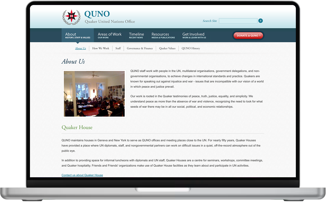

QUNO’s old site had reached the end of its life. A dated look didn’t reflect an organisation working at the forefront of global dialogue at the United Nations. Decades of intelligence, investigation, and advocacy work were buried in a structure nobody could navigate – including their own team.
We started with a full copy audit and built a new image bank from scratch. New site maps. Proper content migration. Advanced filtering and tagging so that QUNO’s rich archive of resources finally became findable. We augmented their brand, integrated fundraising, and set up URL redirects to protect every link that had ever been shared or cited. The result is a site that genuinely represents what QUNO does on the world stage – and gives their team the tools to keep it current without depending on a developer every time something needs to change.
“The redesign of our website has been excellent – simple, consistent, user-friendly, and responsive. I genuinely can’t see room for improvement.”
– Charity client, Circular DesignSometimes You Don’t Actually Need a Redesign
We say this as a web design agency, which might seem counterproductive: a full website redesign is not always the right answer. It’s often the most expensive answer, and sometimes it’s solving the wrong problem entirely. We’ve had initial calls with charities who were convinced they needed a new website, and what they actually needed was a rewritten homepage and a fixed donation page. That’s a few thousand pounds, not twenty.
Some honest reasons to pause before committing to a full redesign:
- The problem is the message, not the design. If your website looks fine but your pages don’t convert, your story isn’t landing, or visitors leave without doing anything – that’s usually a content problem. Better copywriting and a clearer structure will often fix it without touching the design at all.
- You’re in the middle of a campaign or major push. Migrating to a new site during your peak fundraising season is a genuine risk. Even a well-planned migration can cause temporary technical issues. If your year-end appeal runs in November, don’t launch a new site in October.
- You haven’t had an audit first. A good UX audit will often identify the specific pages and journeys causing problems. Fixing those three things might deliver 80% of what a full redesign would – at a fraction of the cost and disruption.
- Your team can’t manage what comes after. We’ve seen organisations launch beautiful new sites and then leave them untouched for two years because nobody had time or confidence to update them. A simpler site that your team can actually use is worth more than a complex one they avoid touching.
We’ll always tell you if you don’t need a full redesign. That conversation costs us project revenue sometimes. But it’s the right thing to say, and clients remember it. If a UX audit and targeted fixes will get you where you want to go, we’ll tell you that – and we’ll do the fixes rather than a rebuild.
How to Write a Brief That Actually Gets You What You Need
If you’re bringing in an external agency or freelancer, you’ll need to write a brief – or what some people call an RFP (Request for Proposal). The quality of your brief directly determines the quality of the proposals you get back. A vague brief attracts vague proposals. A clear brief attracts serious ones.
It doesn’t need to be a 30-page document. It needs to answer these questions clearly:
- Who you are and what you do – don’t assume the agency knows your sector. Explain your work as if to an intelligent outsider, because that’s what they are.
- Why you’re doing this now – what’s the problem? What changed? What will look different six months after launch if the project succeeds?
- What you need built – roughly how many pages, what integrations (CRM, donation tools, email), what languages, what accessibility standards. Be clear, but don’t over-specify. You’re hiring expertise, not issuing instructions.
- What you’re not doing – scope boundaries matter as much as requirements. If you know the brief excludes a members’ portal or an e-commerce shop, say so.
- Your budget range – include it. We know the instinct is to hold it back and see what comes in, but what actually happens is you get proposals ranging from £3,000 to £50,000 and have to start the whole process again. A budget range lets agencies tell you honestly whether they can deliver what you need. It saves everyone time.
- Timeline and hard deadlines – are there grant reporting dates, AGMs, campaign launches, or conference dates the site needs to be live before?
- Who’s involved in decisions – who approves, who gives feedback, who has final sign-off? This matters more than it sounds. Projects where this is unclear almost always run late.
One practical tip: Share two or three websites you actually like – not necessarily charity sites – and explain specifically what you like about each one. “I like how this site structures its impact data” or “this donation flow feels trustworthy and quick.” Concrete references are worth a hundred words of vague aspiration, and they save a lot of time in early design conversations.
Five Mistakes We See Constantly – and How to Avoid Them
These come up in real projects, often when it’s too late to fix cheaply. We’re sharing them here because pattern recognition is genuinely useful – if you know what to watch for, you can stop it before it costs you.
-
1
Falling in Love With a Design Before You’ve Asked What the Site Needs to Do
We see this in the first meeting sometimes – a client comes in with screenshots of three websites they love the look of, and it becomes clear that nobody has yet asked what the website is actually supposed to achieve. Beautiful briefs produce beautiful wireframes that solve the wrong problem. Before any visual conversation, get the goals, the audiences, and the key journeys clear on paper. The design should follow from those, not lead them.
-
2
Starting the Build Before the Words Are Written
This one hurts the most because it slows everything down at exactly the wrong moment. A developer finishes a page template and needs final copy. Someone says it’s nearly ready. Three weeks later, the design has been compromised in six places to accommodate content that arrived late and doesn’t quite fit the layout it was designed around. Write the core pages – or at least rough them out – before a wireframe is drawn. It’s a discipline that pays back immediately.
-
3
Not Planning the Redirect Map Before Launch
We’ve mentioned this twice already. That’s deliberate. Changing your URL structure without a complete 301 redirect plan is the single most common and most preventable cause of organic traffic loss after a redesign. Every URL that returns a 404 error is a broken link for your users and lost authority in Google’s eyes. This takes one focused afternoon to plan properly and a few hours to implement. It’s not optional.
-
4
Treating Accessibility as a Nice-to-Have
It isn’t. It’s a legal requirement in many jurisdictions under laws that exist specifically to protect people with disabilities from being excluded from public digital life. It’s also – and we say this from experience – what makes websites genuinely better. When you design with screen readers in mind, with keyboard navigation as a requirement, with clear contrast and logical structure, you end up with something that works better for everyone. Start from those constraints. Don’t patch them in at the end.
-
5
Treating Launch Day as the End of the Project
A website that nobody maintains is a liability within about eighteen months – outdated plugins, unpatched security vulnerabilities, content that’s no longer accurate, and performance that quietly degrades as the wider web evolves around it. Budget for ongoing care from the start. If the organisation can’t afford it, that’s a signal to build something simpler that’s easier to maintain. Our website care plans start from a monthly rate that most small charities can absorb – it’s worth asking about early.

Four Project Risks That Kill Redesigns (Before They’re Even Built)
These aren’t design problems or technical problems. They’re people and process problems – and they cause more project failures than any technical issue ever does.
No one owns the project on your side. When the CEO, board chair, and comms lead all have different priorities and nobody has been given clear authority to make final decisions, every approval takes weeks. Every feedback round reopens settled questions. Every milestone slips. Before a single brief is written, agree on who the internal project lead is – one person who can make decisions and be the agency’s main contact.
Decisions get made on gut feeling, not data. We’ve watched board members and senior leaders override carefully researched UX decisions because someone on the committee “just doesn’t like it.” That’s human. But it’s also how you end up with a site that reflects the internal view of the organisation rather than the actual needs of its visitors. When you’re tempted to go with your instincts, run a test instead. Which brings us to something most nonprofits aren’t doing but should be.
You’re not testing enough. A/B testing – trying two versions of a page or a form and measuring which one performs better – is one of the most powerful tools available, and it’s largely unused in the nonprofit sector. One study by NextAfter tested a text-only donation page against a page with an embedded video. The text-only page generated 560% more donations. Not 5%. Not 50%. Five hundred and sixty percent. The point isn’t that video is always worse – it’s that relying on intuition alone is genuinely no better than guessing. Set up simple tests on your donation page after launch. Headline copy, button text, the order of form fields, whether to show the suggested donation amounts or not. Small changes, measured carefully, compound over time into meaningful differences in revenue.
Timeline myopia. Most people underestimate how much earlier phases affect later ones. Extra time spent on discovery means faster development. Time saved on content strategy nearly always gets paid back with interest during build. And rushed testing before launch almost always surfaces problems you then have to fix in a hurry. When you plan your project timeline, build in more slack than you think you need – especially around content approval and sign-off stages. Those are where almost every project delay actually starts.
A Checklist to Keep You on Track
Redesign projects have a way of moving fast once they start, and it’s easy for the important foundational things to get skipped in favour of the visible ones. Use this as a running reference – not a compliance exercise, but a way to make sure nothing genuinely critical slips through.
✅ Nonprofit Website Redesign Checklist
0 of 17 completed
We offer free initial consultations for charities and nonprofits – no sales pitch, just an honest conversation about where your site stands and what’s actually worth doing.
Questions We Get Asked a Lot
Realistically, between 6 and 16 weeks from the first discovery session to launch – and that’s assuming content arrives on time, which it often doesn’t. A straightforward refresh of an existing site can be done in 4–6 weeks. A full custom build with multilingual support, CRM integrations, accessibility compliance, and a proper SEO migration will take 12–20 weeks. The honest answer is that the content stage is almost always the longest part, not the development. If your team can commit to getting copy and images agreed and approved quickly, projects move significantly faster.
Anywhere from around £2,000 for a targeted refresh to £30,000+ for a complex custom build – and both those numbers can be right for the same size of organisation depending on what they actually need. The scope drives the price, not the charity’s size or profile. Registered charities working with us receive up to 40% off standard rates. It’s also worth checking whether a digital grant could cover some or all of the cost before committing your own budget – more are available than most people realise.
Yes, in our view – and we say that after working with a wide range of platforms. WordPress powers over 43% of the web, which means a huge global community of developers, an enormous plugin ecosystem, and no risk of the platform disappearing or changing its pricing structure in a way that leaves you stuck. For nonprofits specifically, the donation tools (GiveWP, Stripe), CRM integrations (Salesforce, Mailchimp, Blackbaud), and SEO plugins (Yoast, RankMath) available for WordPress are better supported than on any other platform. And because it’s open source, your data is yours – always.
WCAG 2.2 Level AA is the web accessibility standard referenced by UK equality law, the EU Web Accessibility Directive, and US ADA guidance. In practical terms, it means your site needs: enough colour contrast that people with visual impairments can read it (4.5:1 ratio for body text), the ability to navigate everything using a keyboard rather than a mouse, clear descriptive labels on all images and form fields, and a heading structure that makes logical sense to a screen reader. A competent developer should handle all of this as standard, not as an add-on. If someone quotes you extra to make your site accessible, that’s a warning sign.
Not if you plan carefully – and yes if you don’t. The most common causes of post-redesign ranking drops are: changing URLs without setting up 301 redirects, losing page titles and meta descriptions during the migration, and deleting or merging content that was ranking well. We’ve seen charities recover from losing more than half their organic search traffic after a launch because the redirect strategy wasn’t in place. It’s recoverable, but it takes months and costs real money in lost donations during that period. Work with an agency who treats SEO planning as part of the build, not a separate service.
Get a UX audit first. Seriously. A good UX audit will tell you whether your site’s problems are structural (which might need a rebuild) or fixable (which probably don’t). We’ve had clients come to us expecting to spend £15,000 on a new site who left with a £3,000 set of targeted improvements that solved the actual problem. That’s not the most commercially convenient outcome for us, but it’s the honest one – and it’s the advice we’d give a friend in the same situation.
Yes – and most nonprofits aren’t, which is a missed opportunity. A/B testing means running two versions of a page at the same time and measuring which one actually performs better. It takes out the guesswork. Research has shown that even a single change – removing an embedded video from a donation page – can shift donation rates by hundreds of percent. You’d never know without testing. After your redesign launches, set up goal tracking in Google Analytics 4 and start with your donation page. Try different headline copy, different button text, different suggested donation amounts. Run each test long enough to get statistically meaningful results – usually several weeks – before drawing any conclusions. The cumulative effect of small, evidence-based improvements made consistently over time is one of the most underused advantages available to nonprofit websites.
Thinking About a Redesign?
Let’s Have an Honest Conversation First.
We work exclusively with charities and nonprofits. No hard sells, no bloated proposals – just a straight conversation about your site, what’s working, and what’s worth changing.


