Website design best practices are the guiding principles you can use to shape the interactions people have with your site.
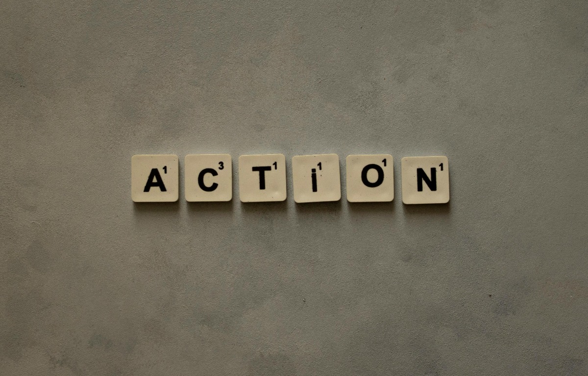
Your website is one of the most powerful tools your nonprofit has. Use it not just to inform, but to inspire action. Whether you’re encouraging donations, building community support, or delivering services, your website needs to work hard for your mission.
But it’s not enough to simply have a website, it needs to be well-designed. That means applying proven web design best practices to create a site that’s clear, accessible, and conversion-focused. A great nonprofit website should be easy to navigate, emotionally engaging, and built around the real needs of your users.
In this guide, we’ll walk through essential web design principles tailored to charities and nonprofit organisations — from understanding your audience and setting clear goals, to improving accessibility and tracking performance. Whether you’re building from scratch or improving an existing site, these best practices will help you turn visitors into supporters and maximise your organisation’s impact.
1. Know your audience
Every effective website begins with a clear understanding of its audience. If you don’t know who you’re designing for, it’s easy to create a site that speaks to no one.
For nonprofits, audiences might include donors, volunteers, beneficiaries, or partners — often all at once. Take time to map out who visits your site, why they come, what they need and which pages different groups will navigate to. Tools like personas, user interviews, or website analytics can provide clarity.
By tailoring your content, design, and navigation to each group, you ensure people see themselves in your message — and are more likely to take meaningful action.
Tip: Prioritise key content for each audience group.
2. Set clear goals
Once you know who your audience is, align your website design with your core goals. For most nonprofits, this includes actions like:
- Making a donation
- Signing up to volunteer
- Subscribing to a newsletter
- Reading about your impact or services
With clear goals in place, every design and content decision can be focused on achieving a specific outcome. Knowing what your goals are will also allow to track success more meaningfully using measurable KPIs — like form submissions, button clicks, or bounce rates.
Tip: Define 2–3 top conversion goals, and design pages to support them.
3. Communicate your message
Your website is often the first impression people have of your organisation — and you only have a few seconds to make it count. Research shows users form judgments about websites in just 50 milliseconds. This is why the hero section of your website really is the “hero” and can save you from missed opportunities to engage a new supporter.
A website’s hero section should be the most prominent and attention-grabbing area on a page. It needs to capture a visitor’s attention, convey the website’s core message, and guide them towards a desired action.
Keep visitors hooked with:
- A clear headline about who you are and what you do
- Prominent call-to-action that relates to your core website goals (e.g. “Donate Now,” “Join Us”)
- A strong visual identity that evokes an established brand
- Focused and scannable content
Tip: Avoid jargon and speak in the language your audience uses.
4. Optimise for Key Conversions
The user experience of your website will directly affect the conversions that happen on it. Users make a judgment about whether to stay or leave based on a “gut feeling” driven by their impression of the content and design of a site. This is largely driven by the expectations they have built based on previous experience with similar sites.
Make it enjoyable to use with simple and consistent designs that are intuitive to use from the first click. Guide visitors through your website with clear CTAs that catch the eye and let visitors know where to go next.
- Design an easy-to-use donation page (fewer clicks, minimal friction)
- Offer suggested donation amounts or “impact tiers”
- Use trust signals: badges, testimonials, transparent financials
- A/B test CTA button copy, placement, or page layouts
Tip: Set up custom goals (e.g. form submissions or donation clicks) to measure success.
5. Make It Accessible to Everyone
Accessibility best practices are simply good web design best practices. By making your website accessible you’re also making it more usable for everyone.
The curb-cut effect shows how design choices made for people with disabilities often improve things for all users. This famous example describes how the curbs on pavements were graded down to meet with the street so that wheelchair users could easily transition from the pavement to the road. But this design choice has improved the experience for people outside of this group too, such as people pushing prams, elderly people, cyclists, or anyone dragging a suitcase.
Simple ways to improve accessibility:
- Make sure all text has a good colour contrast ratio with the background colour
- Add descriptive alt text to images
- Ensure keyboard navigation and screen reader compatibility
Tip: Follow WCAG 2.1 AA standards
6. Track, Learn, and Improve
Designing a great website is never a one-and-done job. The best nonprofit websites evolve based on evidence, user behaviour, and strategic goals.
Using analytics tools like Google Analytics or Matomo, you can understand how users behave and where they drop off
- Identify high-impact changes through audits and data
- Track success using clear goals and KPIs
- Make evidence-based decisions that improve outcomes over time
Pair analytics with periodic UX audits, accessibility reviews, or user testing to uncover friction points and improve the user experience.
By continuing to experiment and assess user behaviour in response to design and content changes you can turn more visitors into supporters, donors, or subscribers by learning from your audience insights. Spend less time guessing what works and more time scaling what does.
Tip: Build a habit of testing small changes and tracking results.
Conclusion
Following these website design best practices will ensure your website is doing what it needs to do: showcasing your mission to the world.
A great nonprofit website doesn’t just look good, it drives you forward. By focusing on your audience, setting clear goals, and following inclusive design principles, your website can become one of your most effective tools for impact.
Use data and user feedback to guide continual improvements. Test. Learn. Refine. The result? A site that builds trust, deepens engagement, and turns more visitors into long-term supporters.
Want expert eyes on your website?
We offer bespoke website design and development for purpose-led teams. Reach out to us today to get started.